Self-Service Return Kiosk
Led design research for a Fortune 10 e-commerce client to reimagine a self-service return kiosk that improves usability, ergonomics, and workflow efficiency in stores nationwide.
Tools
FigJam / PowerPoint / Dovetail / Excel / Otter.ai
Team
3x UX Researchers / UX Designer / Systems Engineer
Skills
Project Management / Test Planning / User Interviews / Contextual Inquiry / Usability Test Moderation / Analysis / Reporting / Client Presentation
Timeline
5 months, 2025
Role
Lead UX Researcher
Context
Problem & Objectives
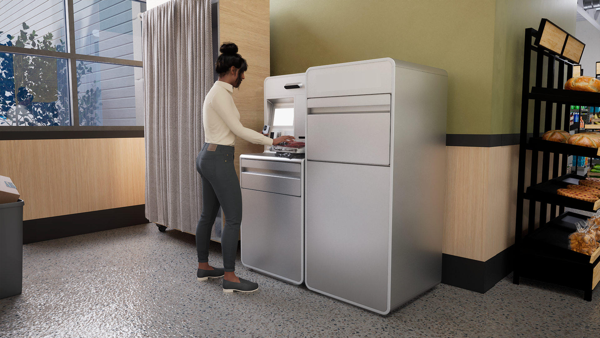
The existing return kiosks in grocery stores had inefficient workflows: customers faced too many steps, and staff experienced friction when emptying and servicing the machines. These issues were compounded by ergonomic and accessibility shortcomings, which made the kiosks difficult to use for a wide range of customers, including wheelchair users.
The kiosks were also inconsistent with the client’s other self-service touchpoints, creating an uneven experience across their product ecosystem. Incremental fixes weren’t enough, so the client asked us to explore concepts for an entirely new kiosk design.
Our team was tasked with reimagining the return kiosk experience to:
Streamline workflows for both customers and staff by reducing workflow steps
Improve ergonomics and accessibility for a wide range of users, including wheelchair users
Make the design and user experience consistent with client’s product ecosystem
Project Breakdown
To address these challenges, we carried out three research studies that moved from exploring customer needs to evaluating and downselecting design concepts. Each study built on the previous one, giving us both user and operational perspectives to guide recommendations.
Generative Research (4 weeks)
Evaluative Research (4 weeks)
Workflow & Operational Research (X weeks)
Study 1: Generative Research (4 weeks)
Objective
Understand how customers and staff interact with existing return kiosks, identify workflow pain points, and uncover expectations for a redesigned experience.
Methods
Desk research: Reviewed existing kiosk solutions in retail and self-service environments to benchmark features and best practices.
Customer contextual inquiry: Observed customers using current kiosks in grocery stores, noting behaviors, workarounds, and sources of friction.
Staff contextual inquiry: Observed store associates servicing kiosks, noting frequency, effort, and operational challenges.
Customer and staff interviews: Spoke with 8 customers and 7 store associates about kiosk habits, accessibility, and servicing needs.
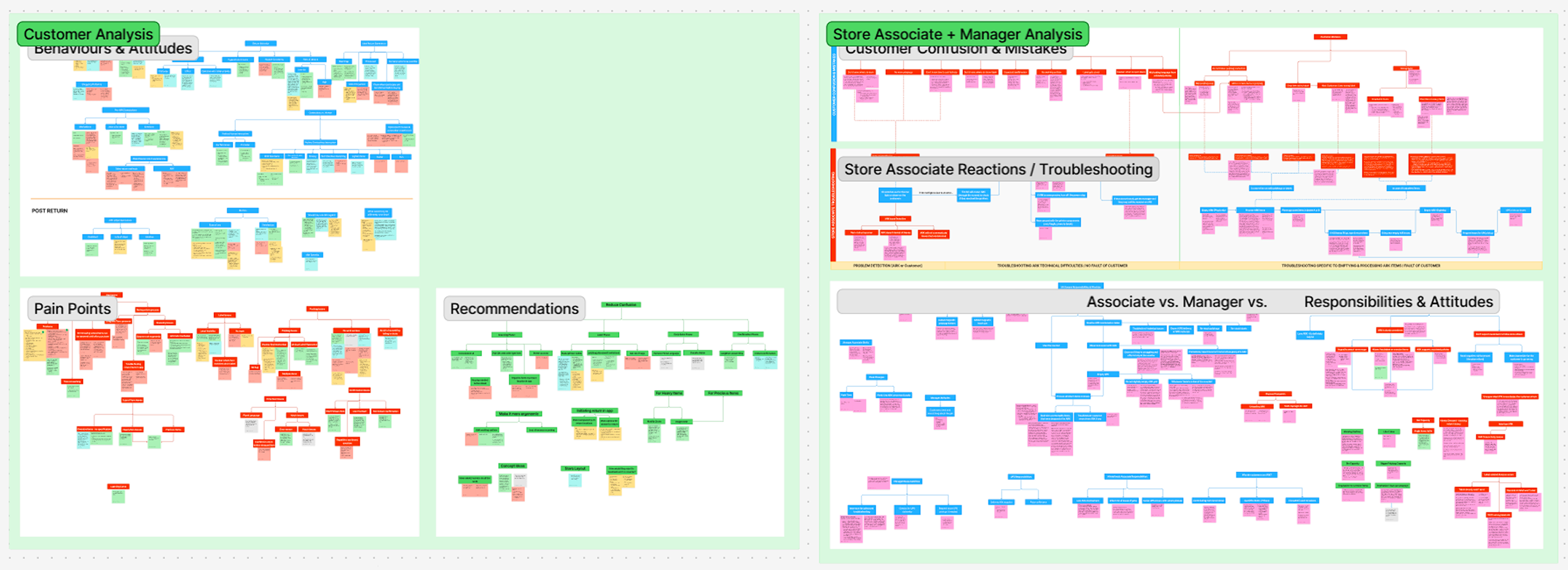
Qualitative analysis & affinity mapping: Synthesized observations in FigJam to identify recurring patterns and themes.
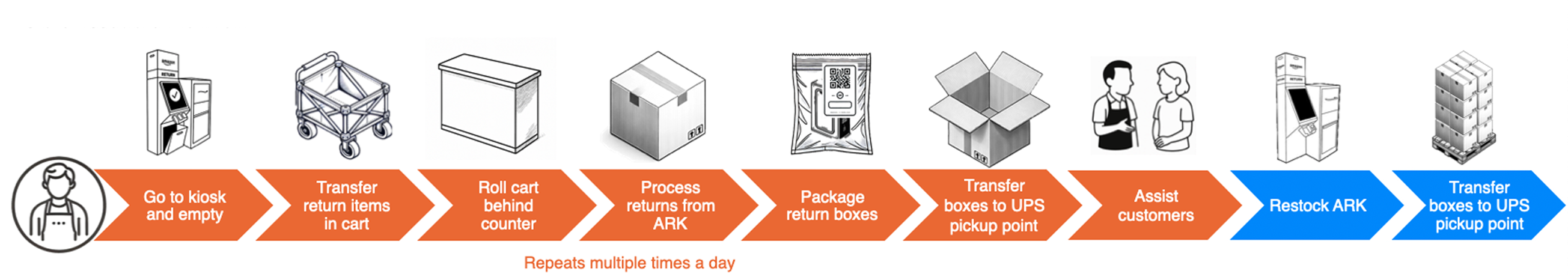
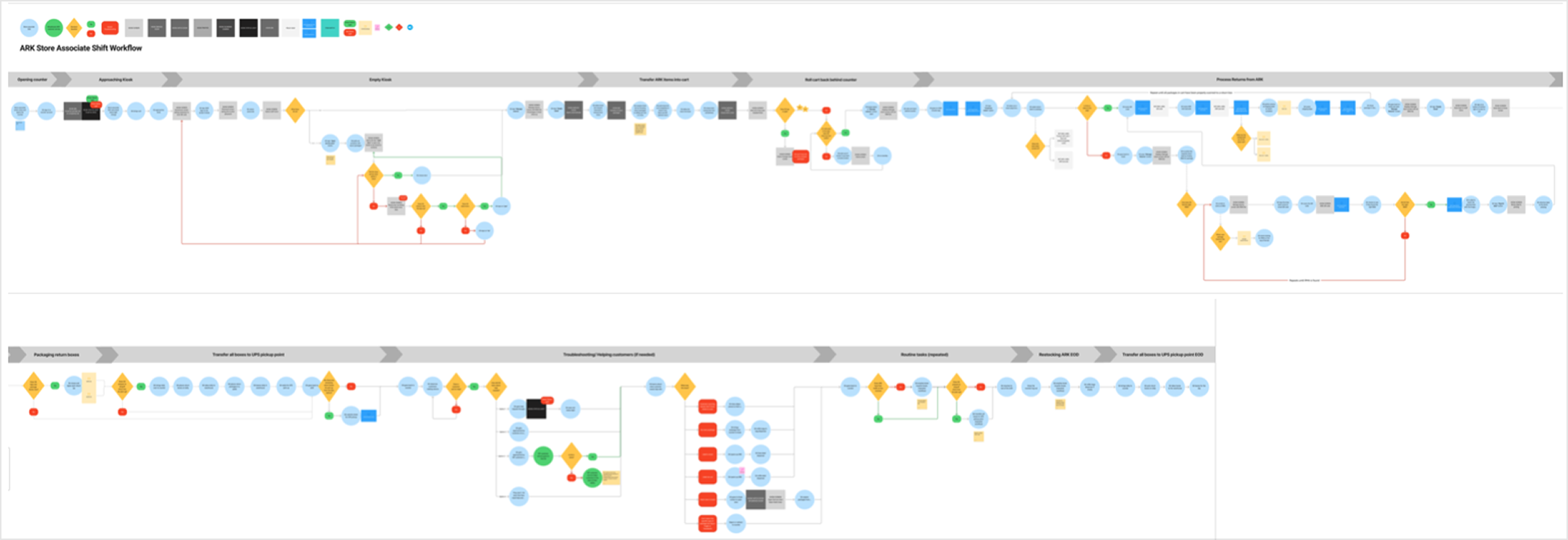
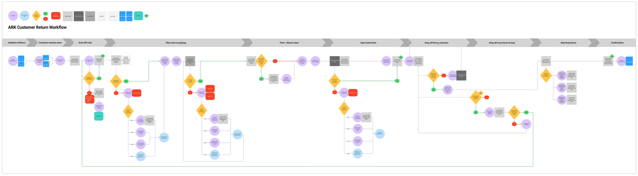
Workflow diagramming: Mapped customer and staff interactions with existing kiosks.
User Interviews (Contextual Inquiry)
(images)
Workflows & Journeys
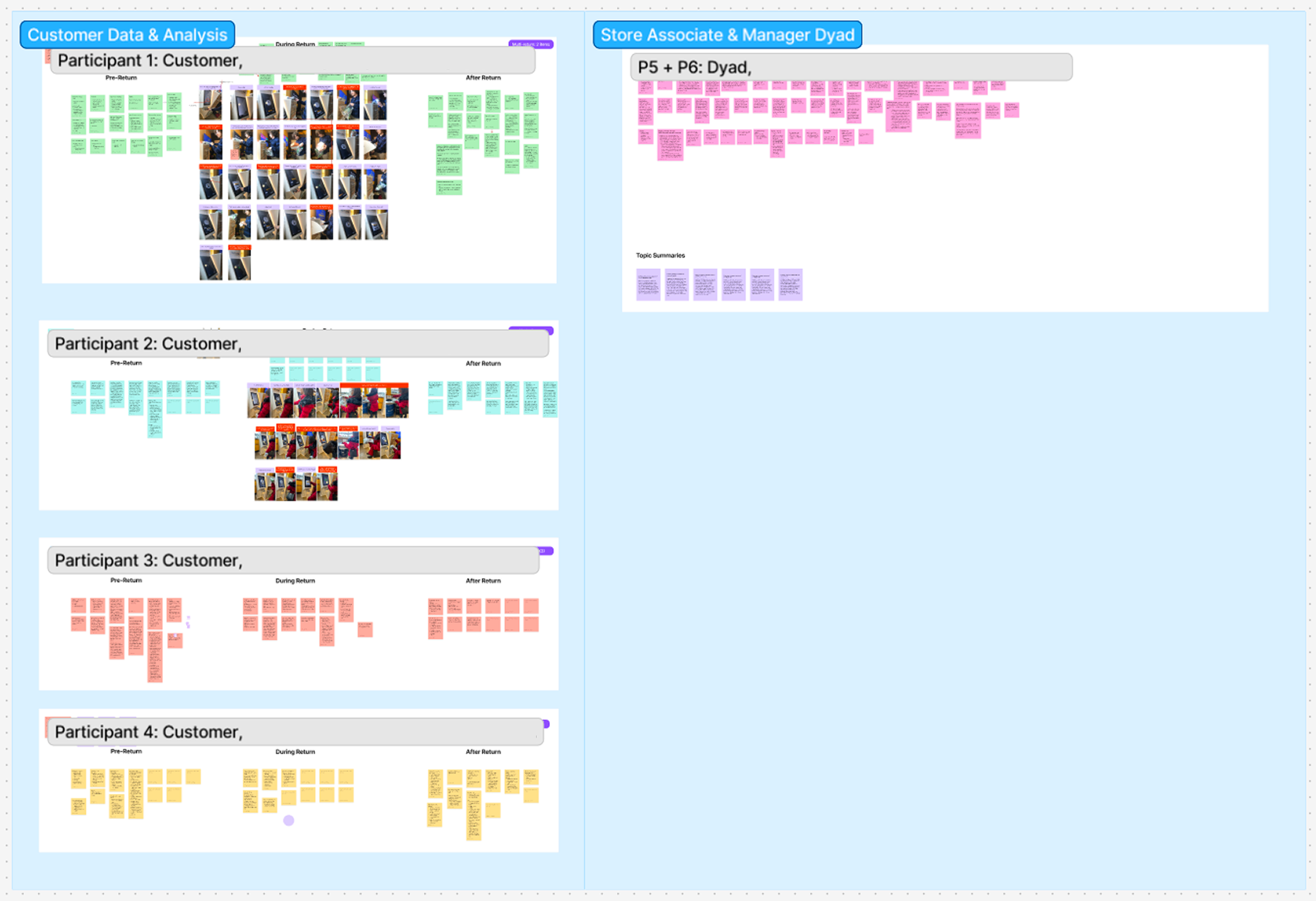
Notes & Synthesis
My Role
I developed the research plan and moderation guide, scheduled team meetings, and delegated tasks across our research group. I led contextual inquiry sessions with customers and staff, moderated interviews, and synthesized findings in FigJam through affinity mapping and workflow diagrams. I authored the study report and presented key insights to client stakeholders, while coordinating closely with our UX, industrial design, systems, and PM teammates to translate findings into design opportunities.
Key Findings
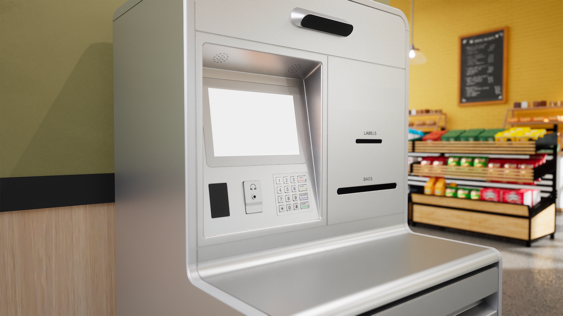
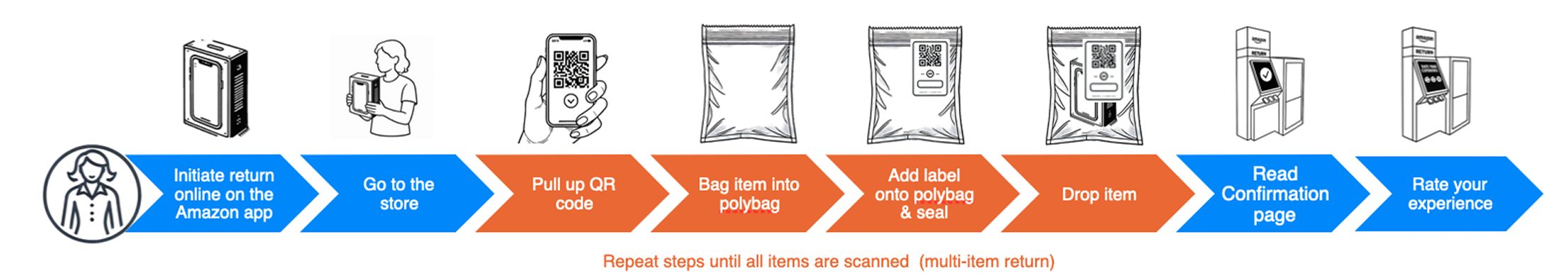
Workflow inefficiency: Customers struggled with unclear instructions, multi-step bagging and labeling processes, and no dedicated work surface, leading to frequent errors (e.g., missing labels, unsealed bags, restricted items).
Accessibility & ergonomics: Many returns required two hands, leaving no place to set down belongings. This created additional friction for customers with mobility limitations.
Staff burden: Store associates had to empty bins up to 10–15 times per day at busy locations, often reprocessing mistakes caused by unclear guidance or system gaps.
System gaps: Kiosks lacked preventative prompts, error detection, and clear status indicators, increasing the need for associate oversight.
Impact
This study clarified the most urgent pain points for both customers and staff, giving the team a prioritized set of design requirements and oppurtunities:
Work surface & ergonomics: Identified the need for a stable surface and improved kiosk design to better support accessibility.
Scanner & label visibility: Recommended clearer placement and step-by-step guidance to reduce user confusion and errors.
Servicing efficiency: Highlighted the importance of larger bin capacity, more visible status indicators, and integrated material storage to reduce staff burden.
Error prevention: Emphasized proactive prompts and feedback to make the kiosk more self-sufficient and scalable across stores.
Together, these findings provided actionable direction for designing a more accessible, ergonomic, and efficient return kiosk.
Study 1: Evaluative Research (4 weeks)
Objective
Evaluate early kiosk concepts to identify which layouts, workflows, and UI patterns best supported usability, accessibility, and efficiency.
Methods
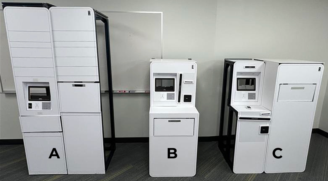
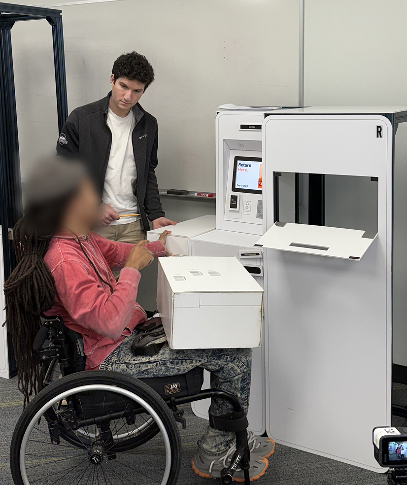
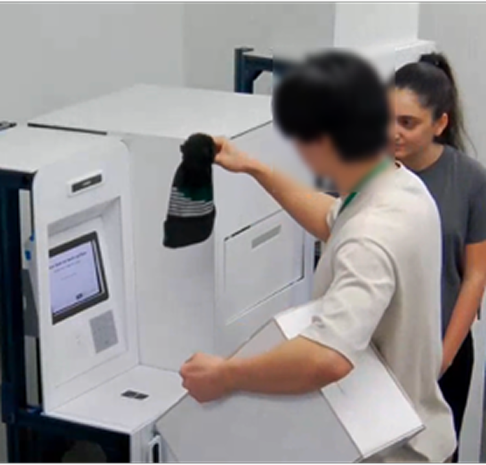
Prototype usability testing: Moderated sessions where participants completed return tasks on three physical kiosk mockups with touchscreen prototypes.
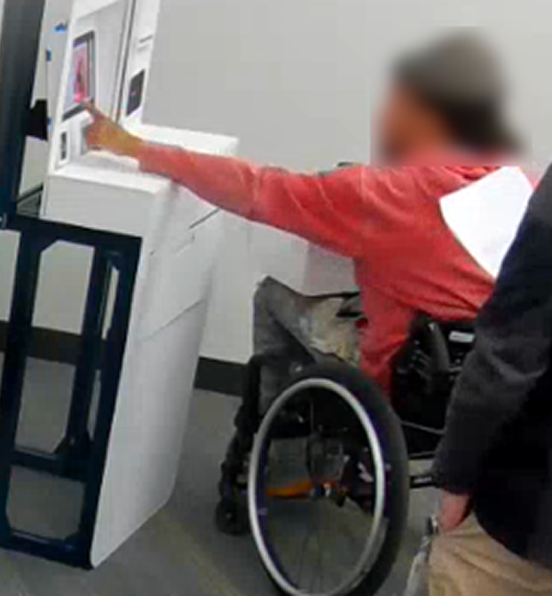
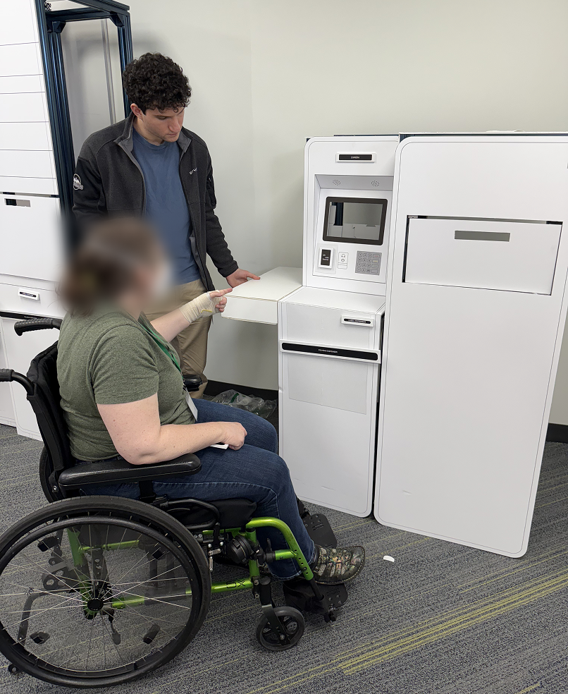
Accessibility focus: Recruited participants across 5th–95th percentile height range, including three wheelchair users, to evaluate ADA compliance.
Participatory design (“Build-Your-Own Kiosk”): Gave participants modular kiosk components to prioritize and arrange, revealing preferences for layout and features.
A/B testing of UI screens: Compared alternate screen flows to measure clarity, speed, and user preference.
Qualitative analysis & affinity mapping: Synthesized observations in FigJam to identify recurring patterns and themes.
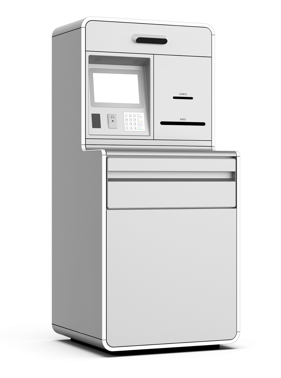
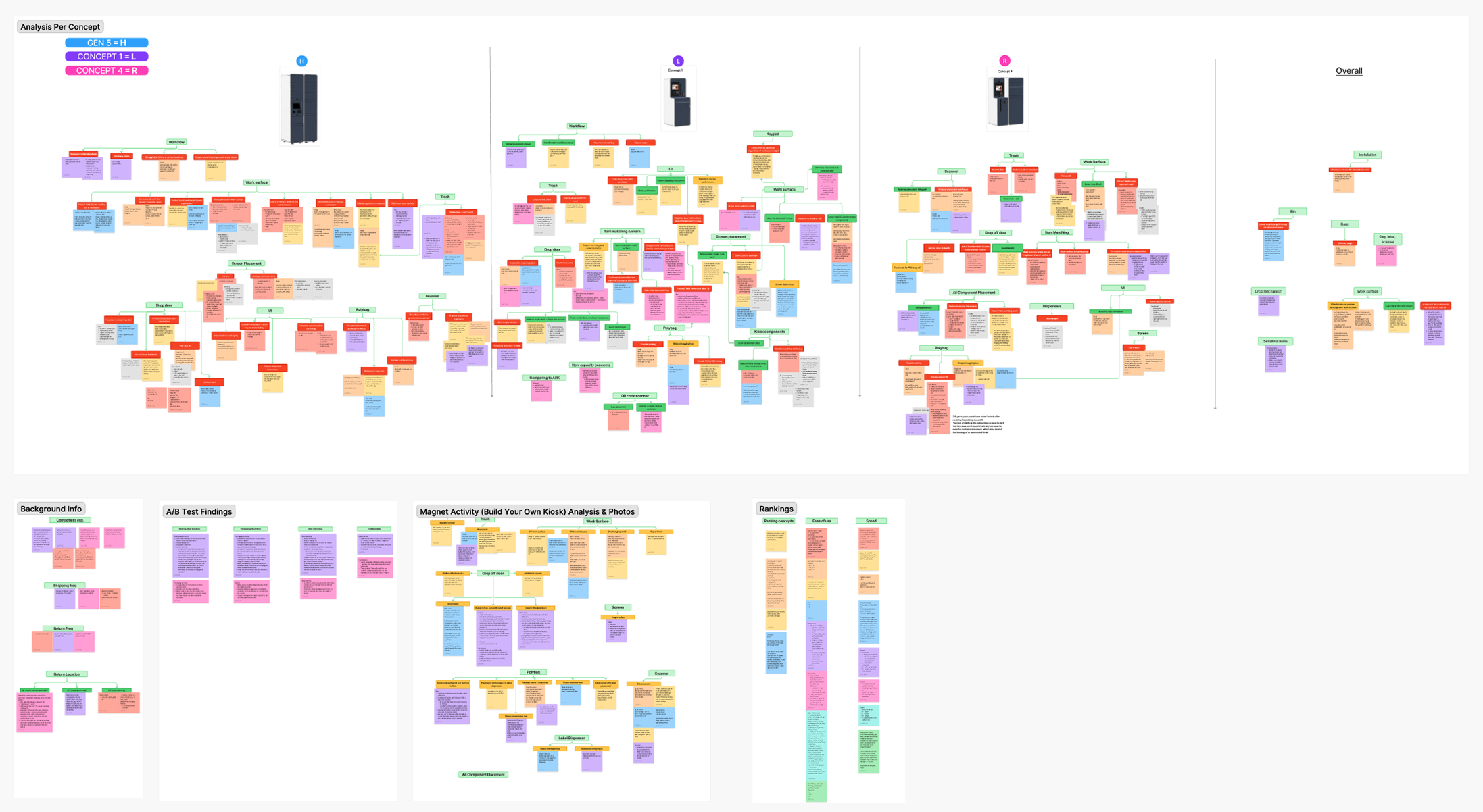
Concepts Tested
User Testing in Action
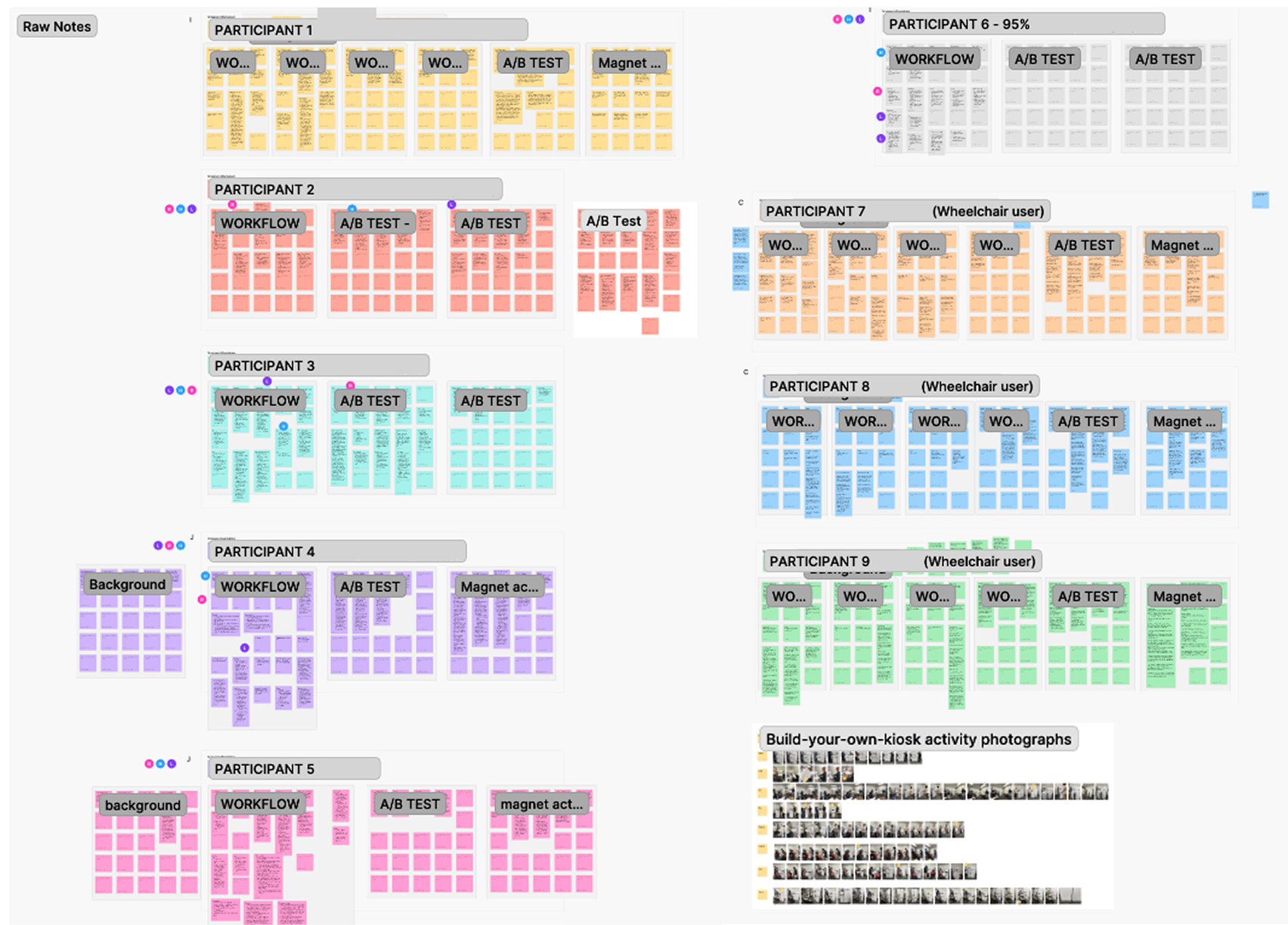
Notes & Synthesis
My Role
I created the research plan and moderation guide, organized responsibilities within the research team, and aligned progress through weekly meetings. I moderated usability sessions and facilitated the participatory “build-your-own kiosk” activity. I authored the study report and presented recommendations to client stakeholders, collaborating with design, systems, and PM partners to refine kiosk concepts.
Key Findings
Preferred layouts: Participants favored Concept B’s layout for grouping key components near the screen but preferred Concept C’s higher drop-off door for accessibility. Many suggested a hybrid design combining strengths of both.
Work surface ergonomics: Most participants preferred a 34” work surface over 38”, noting that higher surfaces blocked the screen and created challenges for wheelchair users. A larger or cantilevered design was recommended to improve legroom and access.
Accessibility priorities: Wheelchair users highlighted the importance of clear access to interaction points, recommending higher drop doors and cantilevered work surfaces to reduce strain.
Workflow clarity: Participants valued kiosk designs that anticipated steps and removed unnecessary actions (e.g., skipping bagging/scanning when not required). Visual cues (animations, lights) improved navigation and confidence.
Final Kiosk Design